Graphic design for the booklet
“Fare Buona Impresa. Principi e linee guida per impreditori, manager, consulenti”. 2024
The graphic design for this second editorial project by Michele Alessi consists of a clean, minimalist layout, with an essential typographic choice, monochromatic backgrounds, and selective color highlights.
Il progetto grafico per questo secondo progetto editoriale di Michele Alessi si compone di un’impostazione grafica asciutta, con una scelta tipografica essenziale, fondini monocromatici e sottolineature di colore.
Graphic design for a Zigzag Zurich bedding collection.
VARIO emerges from a geometric framework that plays with contrasts between figure and background, density and space. This dynamic matrix unfolds in a sequence of rows and columns, crafting a vibrant, ever-evolving landscape of color that shifts and changes with each perspective.
VARIO emerge da una struttura geometrica che gioca con i contrasti tra figura e sfondo, densità e spazio. Questa matrice dinamica si sviluppa in una sequenza di righe e colonne, creando un paesaggio colorato vibrante in continua evoluzione.
Illustration for a blanket.
Convivio means gathering together. Hands lightly touching, perhaps a hug? An illustration to evoke the invitation to stay together.
Convivio è stare insieme. Mani che si sfiorano, forse un abbraccio? Un’illustrazione che invita a stare insieme.
Graphic design for a Zigzag Zurich bedding collection.
WOOF is an homage to the most ancestral experience of sleeping. VIA: Amorphous cells chase, combine and separate each other. GANCIO is a complex game of shapes that rotate, shift, overlap
WOOF è un omaggio alla più ancestrale esperienza del dormire. VIA: Cellule amorfe si rincorrono, combinano e si separano l’un con l’altra. GANCIO è un gioco complesso di forme che ruotano, si spostano, si sovrappongo.
Graphic design for the booklet “La Buona Impresa”.
Design assistant Alessandro Pagliaro. 2022
The text, edited by Michele Alessi, is a layout that is composed of bold graphic choices: one font, one pattern, two colors, and a grid that rigorously sets each part.
Il testo, a cura di Michele Alessi è un impaginato che si compone da scelte grafiche decise: un solo font, una greca, due colori e una griglia che imposta con rigore ogni parte.
Graphic design for the project “BENVENIDO” . 2022
The graphic design explain the activities of “Cooperativa Progetto Now”, Benvenido is a project created to open the doors of nursery schools to all children, the illustration want to show this inclusivity.
Il progetto grafico espone le attività di “Cooperativa Progetto Now” attraverso Benvenido, un progetto creato per aprire le porte degli asili a tutti i bimbi, l’illustrazione vuole mostrare questa inclusività.
A motion graphic project as a dream to escape from our condition. 2021
Un progetto di animazione grafica come sogno per fuggire dalla nostra condizione.
A Motion graphic project that plays with the dichotomy between masculine and feminine. 2021
Un progetto di grafica animata che gioca con la dicotomia mascolino/femminino.
Graphic design for the booklet “La cura è di Casa” . 2021
The booklet explain the activities of the Verbano Cusio Ossola Foundation for old people, it is made up of a series of cards each one characterized by a different hair style, on the envelope the logo begin the mouth of a woman.
Il booklet racconta le attività della Fondazione di Comunità VCO per le persone anziane, è formato da una serie di schede caratterizzate ognuna da un taglio di capelli differente, sulla busta il logo diventa la bocca di una donna.
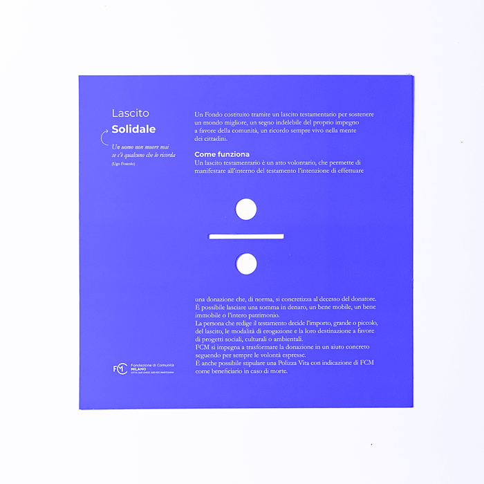
graphic design for the institutional booklet of “Fondazione di Comunità Milano”. 2021
The booklet is made up of a series of cards each one characterized by a different die cutting and a different color.
Il booklet è formato da una serie di schede caratterizzate ognuna da una fustella e un colore differente.
Graphical project for the catalog of the Puglia’s exhibit at the SALONE DEL MOBILE fair of Milan. 2017. With Migliore + Servetto Architects
The graphic design exposes the work of young designers in Apulia, each work fits in on a typical pattern of the region.
Il progetto grafico espone i lavori dei giovani designer pugliesi, ogni lavoro si inserisce su un pattern tipico della regione.
Graphical project for the catalog of the Puglia’s exhibit at the MADE fair of Milan. 2017. With Migliore + Servetto Architects
The graphic design exposes the companies in the Puglia district, the layout is enriched with illustrations of apulian famous people.
Il progetto grafico espone le aziende in ambito edile del distretto pugliese, l’impaginato si arricchisce di illustrazioni ad hoc di pugliesi illustri.
Graphical Brand Identity project for the "Qubì" project by Fondazione Cariplo. 2017
Brand Identity for the poor's support project by Cariplo Foundation, the name suggests the right size of help and logo shapes restrain the food.
Brand Identity del progetto di sostegno ai poveri di Fondazione Cariplo, Il nome suggerice la giusta misura di aiuto e le forme del logo rimandano al contenere il cibo.
Video by Daniele Pellizzoni
Graphical project for Pianca stand at Salone del Mobile. Milano, 2016.
Graphic design for Pianca stand during the Salone del Mobile in Milan .
Grafica per lo stand Pianca durante il Salone del Mobile di Milano.
Wallpaper design for Texture. 2016
A series of patterns for wallpaper.
Una serie di pattern per carta da parati.
Graphical project for the catalog of the Made in Slum’s exhibit at the Triennale di Milano. Corraini 2013.
Book design for the catalogue of the Made in Slums exhibition, the page layout is linear to make order into a complex system of objects and images.
Book design per il catalogo della mostra Made in Slums, il layout lineare da ordine ad un sistema complesso di oggetti e immagini.
Graphical Brand Identity project for the fashion brand I SANTI. 2016
Logo design of the historical brand of leather accessories based in Milan, the logo is a re-design of the old one.
Brand Identity dell'azienda di moda, il logo è un redesign della precedente immagine coordinata.
Carpet for Nodus with Odoardo Fioravanti, Nodus 2014.
Graphic design for the carpet designed by Odo Fioravanti, the illustration represents the rotor of the airplanes.
Progetto grafico per il tappeto progettato da Odo Fioravanti, l’illustrazione rappresenta il rotore degli aerei ad elica.
llustrations for a book by Chiara Alessi Editori Laterza, 2013
Series of illustrations for Chiara Alessi’s essay by Laterza Editore, the objects are illustrated by the digital media and remind the ancient woodcuts.
Serie di illustrazioni per il saggio di Chiara Alessi per Laterza Editore, gli oggetti sono riprodotti con il media digitale ad evocazione di antiche xilografie.
Graphical project for the Odoardo Fioravanti Industrious Design’s exhibit and communicational layout at the Triennale di Milano. Electa 2010.
Graphic design of the catalogue for the Odoardo Fioravanti solo exhibition. The hexagon element in the exhibit is a symbol of the bees operativity.
Design grafico del catalogo per la mostra monografica su Odoardo Fioravanti. L’esagono, elemento cardine dell’immagine della mostra è simbolo dell’industriosità delle api.
Graphical Brand Identity project for the Fidenza Business Center in Fidenza (PR). 2012-2014
Brand Identity of the multi-function building, the pictogram recall a hug, it corresponds to the desire of containing more functions in a single box.
Brand Identity del building polifunzionale, il pittogramma evoca un abbraccio, corrisponde alla volontà di contenere più funzioni in un unico contenitore.